Interactive stock heatmaps that adapt to your selected metric — volume, price change, PEG ratio, and more.
📋 About
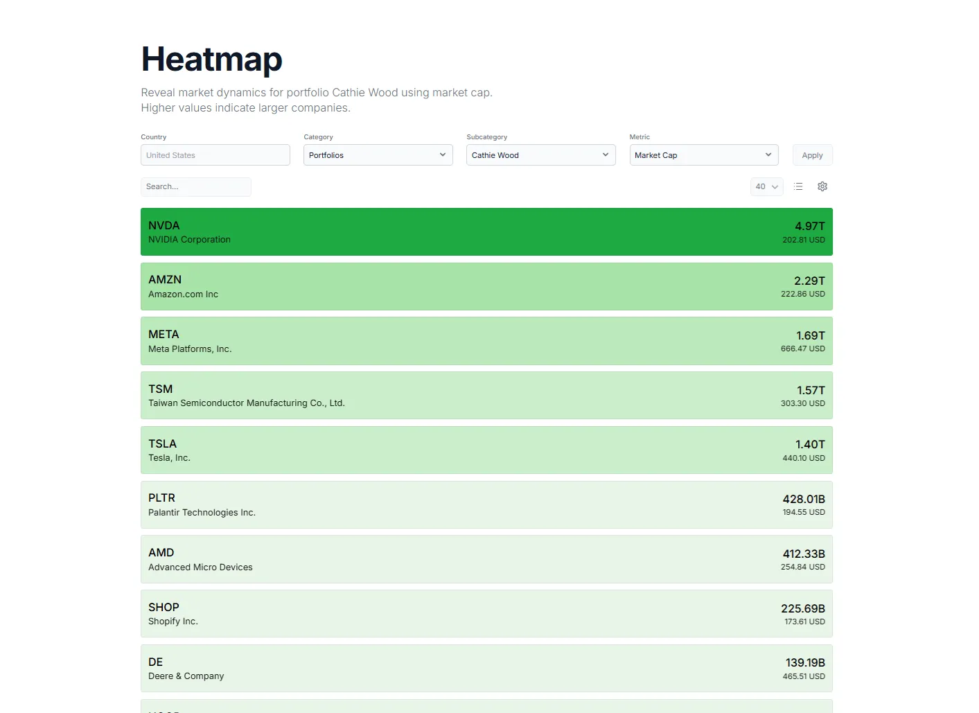
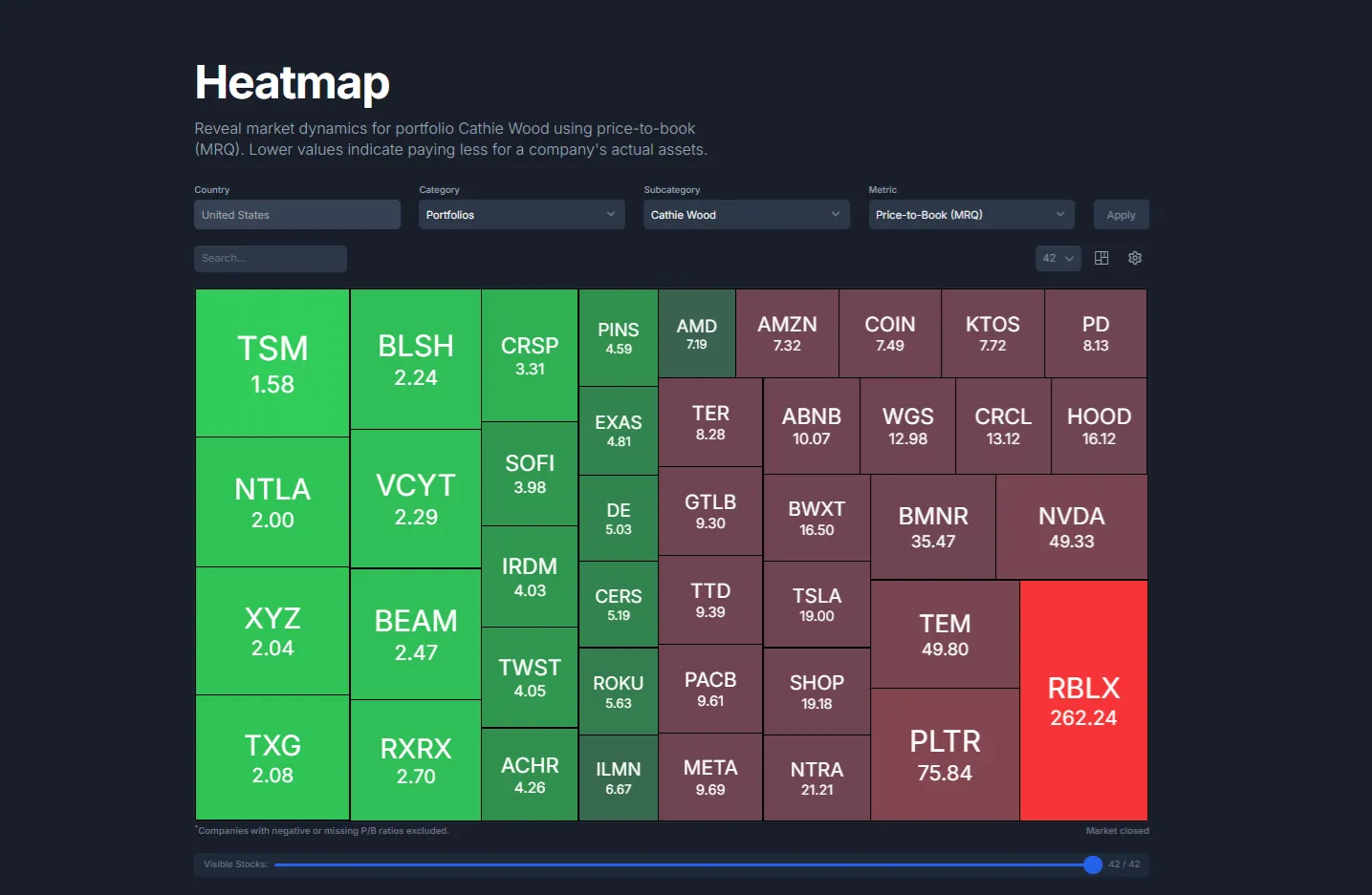
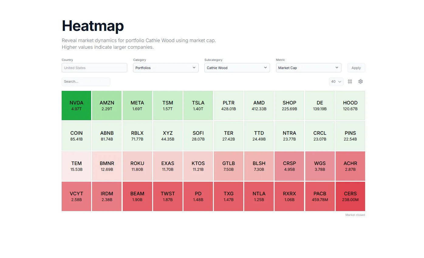
We spent way too much time analyzing stock heatmaps that weren't designed to reveal insights. Most heatmaps force you to view every metric (market cap, volume, price changes) through identical static layouts, even though these metrics tell completely different stories. A $3 trillion company dominates the visual space even when analyzing volume or price change, while smaller high-volume movers get buried. Switch from market cap to volume? The layout stays exactly the same.
We asked ourselves: why should the visualization stay Load more
We asked ourselves: why should the visualization stay Load more
.webp)
Created by
Marketgenius
📊 Product Details
- Status approved
- Launch Date Dec 8, 2025
- Upvotes 9
- Featured No
🏆 Badges & Awards
📈 Social Proof
Week of Dec 14 - Dec 20, 2025
Dec 8, 2025
×
![Gallery Image]()
Login to post a comment
Good question but could you please clarify what you mean by customizing the metrics? If you could provide some examples that would be most helpful.
Thanks in advance!
Login to write a review
No reviews yet. Be the first to review this product!